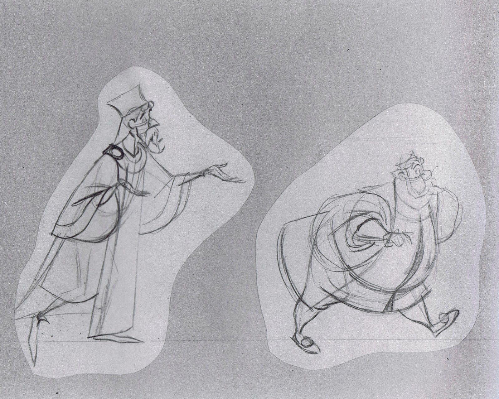
These two father figures from the film Sleeping Beauty were animated by Milt Kahl, John Lounsbery and other animators, but it was Milt who was responsible for the final character design.
This new stylized drawing style was right up his alley, even if it presented challenges. But there was nobody at Disney who enjoyed solving drawing problems more than Milt Kahl (even though he stated that this was always hard work for him.) He reveled in the fact that he was able to give new Disney characters the “That’s it!” look. Perfection that can not be improved.
The Kings are configured of solid round and square shapes, their lines are either straight or curved. There is an architecture to this type of drawing. It’s one thing to come up with good looking designs like these, but then to be able to turn and move them around in space is astonishing.
A few rare examples when Milt used color in his pre-animation research.
Milt refined the way King Stefan’s sleeves would be drawn. When an arm is bent, even the shape of the inside sleeve becomes a very unique design, while showing proper weight at the same time. A few years later Merlin from The Sword in the Stone would benefit from the same graphic sleeve treatment.


0 comentarii:
Trimiteți un comentariu