Part of the breathtaking quality of Classic Disney Animation is the fact that many animators didn't shy away from incorporating beautiful, but tough to draw angles of their characters into the scenes.
This takes enormous drawing expertise and good judgment in terms of when these potentially awkward looking views of the character are called for.
Milt Kahl was accused by some of searching for tough angles in order to show off his draughtsmanship. And yet most animators got endless help from Milt, who strengthend the look and feel of their scenes.
"Why bother and kill yourself by trying to make those difficult head tilts look good, when you can animate the scene in a much simpler way?" This was the attitude of some animators, who indeed got their acting across without dealing with drawing challenges.
The thing is that you add such a great range by having the occasional 3/4 rear view or an extreme up or down shot on your character. It gives the animation rich texture.
Her are just a few examples of what I am talking about.
This 3/4 rear view drawing of Bull from "Lady & the Tramp" is extraordinary. It looks like John Lounsbery didn't even struggle getting this to look right. The only facial parts visible are the nose, a cheek and the jaw. I love those neck folds on his back. A very dimensional pose and so full of character.
Frank Thomas drew this pose of Lady looking back over her shoulder. By blocking in the head's components, he maintains control over the subtle up shot. Final subtleties and appeal might not be there yet, but it would take little time to add those to this solid sketch.
Here Frank has it all worked out in detail. Fauna's expression shows heartfelt sorrow for Aurora's misfortune. The look up toward the other Fairies emphasizes her emotion beautifully. This is the kind of drawing that can make you cry if you look at it long enough.
Shere Khan is about to turn his head and ask Kaa, the snake, his next question about Mowgli during this interrogation. This is a spectacular angle to start the head turn from.
The tiger's head and body are very complex in draughsmanship. The style is graphic, but nothing looks flat. The stripes add a lot of volume, and there is depth in the most subtle things like his eyelid.
This pose of Merryweather has a lot of life. Her upper body is drawn from a 3/4 rear view, her lower body, still a back view, is about to move into profile. The bend in her spine is what gives it movement.
I think Frank did some of his best animation on this character.
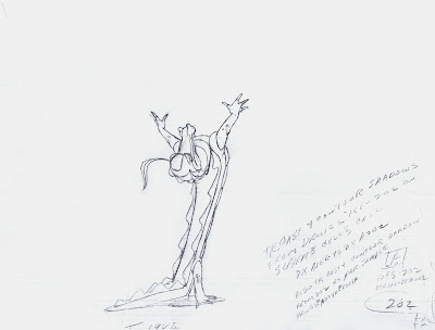
There isn't an angle Milt couldn't draw with Medusa. And I have no idea why her legs come off looking so interesting, without any calfs.
Her inventive design and pose are simplified to perfection, and correct perspective is applied everywhere.
Tony is anticipating a big gesture by raising his head and his arms. Upshots like this one are tricky. Is the nose tilted up enough to show nostrils? Or are you going to cheat a little and stay with just the shape of the nose?
Everything looks pretty broad here, but Lounsbery didn't forget subtleties.
I like the definition of the "U" mouth, the lower lip is partly covering the open mouth, which adds dimension.
Maleficent is an animated fashion drawing (though not quite pret-a-porter).
This is an amazing pose. She is somewhat exhausted here, about to sit down, after her altercation with the goons. "A disgrace to the forces of evil!"
The perspective of the head is just beautiful. Look how the shape of the eyebrows helps define that angle as well as her mood.
I believe Eric Cleworth animated this scene of the dragon in "Sleeping Beauty".
Obviously no live action reference here. The animator figured out this 3/4 rear up shot by himself. The indication of shoulder blades visually connecting the arms to the body works really well.
What a great silhouette.
This is a clean up study by Iwao Takamoto. Aurora's head is just beyond profile, turned toward camera. You just see the far eyelash, which gives her facial angle some depth.
And the near eyelash curves around the eyeball perfectly. Iwao knew subtleties,
he was a master designer.
Ali Gator is anticipating the hippo ballerina's "landing".
This is an outstanding pose drawn from a 3/4 rear view. The body stretch is so strong, while maintaining the solid anatomy of the animal. Great positioning of the arms, and I love how sharply the tail bends when it makes contact with the floor.
Fred Moore drew this Minnie, crying hysterically because she burnt a batch of
cookies. A potentially difficult up shot , drawn effortlessly.
A couple of key drawings of Robin Hood by Milt Kahl. A head up shot with a broad mouth shape and a down shot. Both complex, but very appealing.
His hat is not an easy thing to turn and animate.
Robin goes through a few model changes in the film, I'll have more on that later.


0 comentarii:
Trimiteți un comentariu