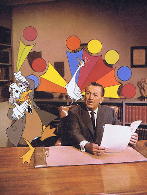
One of my favorite Disney characters!
Milt Kahl came up with his final design in 1960, based on the classic Donald Duck formula. But by then Milt had studied Picasso, and that influence is visible in Ludwig von Drake and most other characters Milt designed in the sixties and seventies. There is an astonishing balance between pleasing shapes and lines.
I would think it isn't easy to put a suit jacket on to a cartoon duck body and make it look natural. If you look at the top left drawing on the model sheet, you see that it is tailored like a real jacket, folds and creases occur in the right places.
As usual Milt made sure that hands are drawn to perfection. The fingers retain a slight feathery feel and are very expressive.
Since his personality is that of a befuddled TV host, he does a lot of talking and explaining. Milt and the other animators who handled him often looked for props they could incorporate in Ludwig's acting. His glasses, a letter or a piece of chalk to write with.
Two of the best TV shows were ""An Adventure in Color" and "Kids is Kids", watch its opening sequence on the bottom of the post.
The first few scenes are by Milt, then Frank Thomas follows. I wonder if you can tell when the switch happens.
Ollie Johnston also did some very nice Ludwigs in other shows.
This is a design sheet, it looks like Milt is trying to figure out what an "O" mouth would look like on this beak.
Here is a drawing Milt did for a Frank Thomas scene.
A selection of beautiful rough key poses.
This sheet shows that Milt could draw Ludwig's head from tough angles and make it look fantastic.
And this was animation for television!!


0 comentarii:
Trimiteți un comentariu